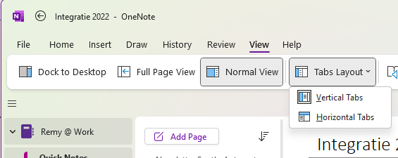
Vertical tabs have arrived in OneNote (2016, the classic Windows app).
When the new OneNote for Windows came out, I liked the simplicity. The 'classic' OneNote had so many features to accommodate everyone, that it became cluttered.
One of the simplicities was the vertical tabs, which looked the same on every device, from desktop to web and mobile.
The new OneNote for Windows was supposed to be the next version. Power Users were not happy with this new version and continue to use the 'classic' OneNote. So, Microsoft backtracked from this, and started to invest again in the 'classic' OneNote.
They started to copy the good parts from the new OneNote to the 'classic' OneNote. They are making 'classic' OneNote less cluttered and now also have added the option for vertical tabs.
How it works: Click View > Tabs Layout > Vertical Tabs.
